Willycantplay
WorkAboutLabWriting

Designing complex products for technical founders — from first brief to working prototype.

Sitemap

Work
About
Lab
Writing

or reach out directly to

wllfreduche2018@gmail.com
SynapseAI-power RPC dashboard 2026

Making infrastructure legible

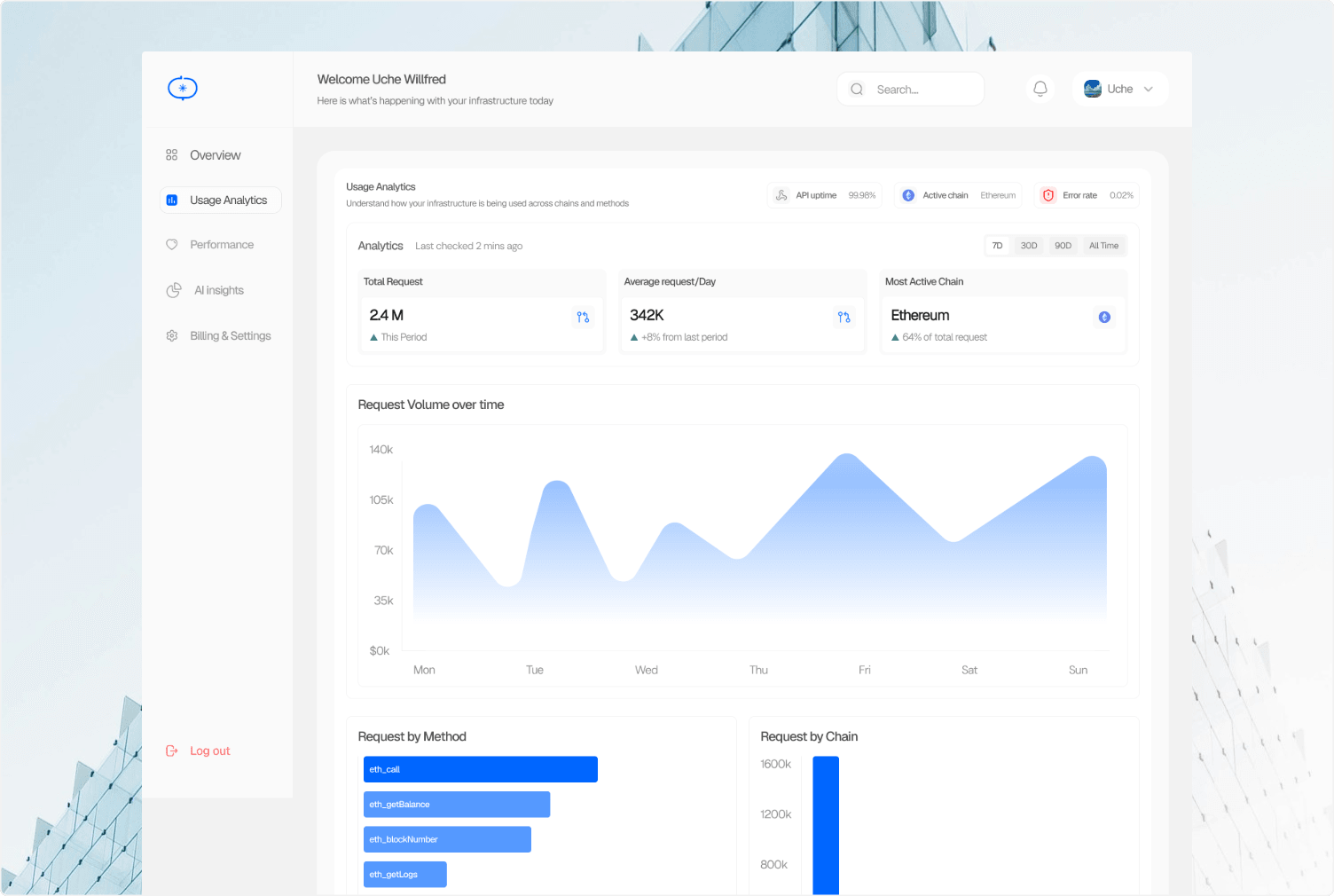
Synapse dashboard preview
SynapseSynapse
Complexity made simple
DataIntelligence

Role

Product DesignerBrand DesignerDesign Engineer

Timeline

May 2026-Jul 2026


Contribution

Product DesignBrand designDesign Engineering

Overview

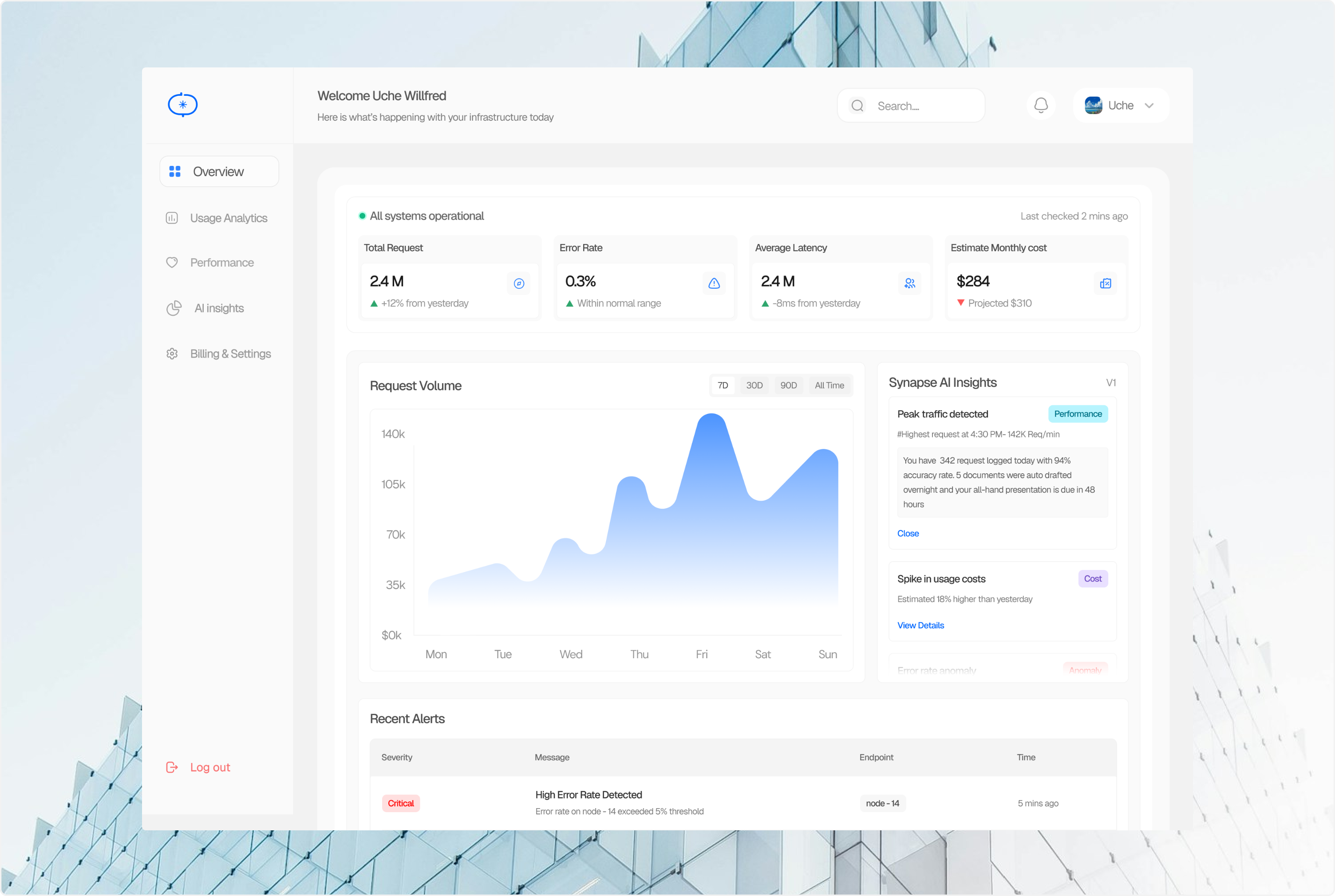
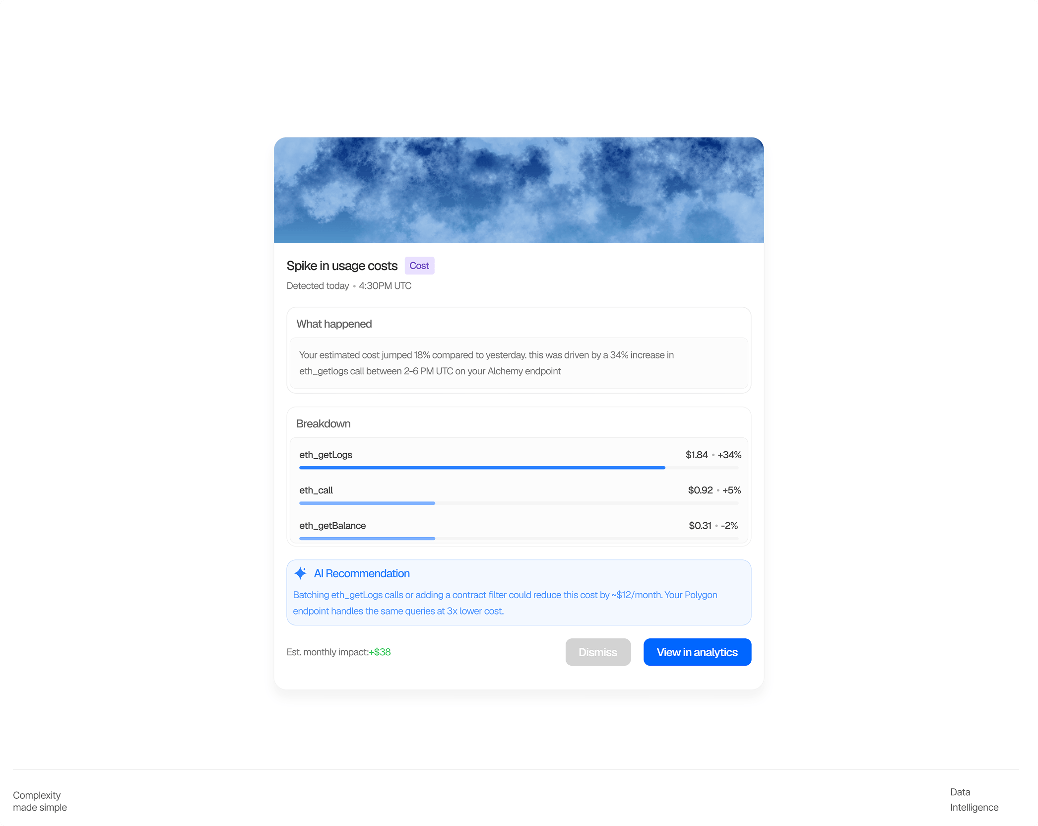
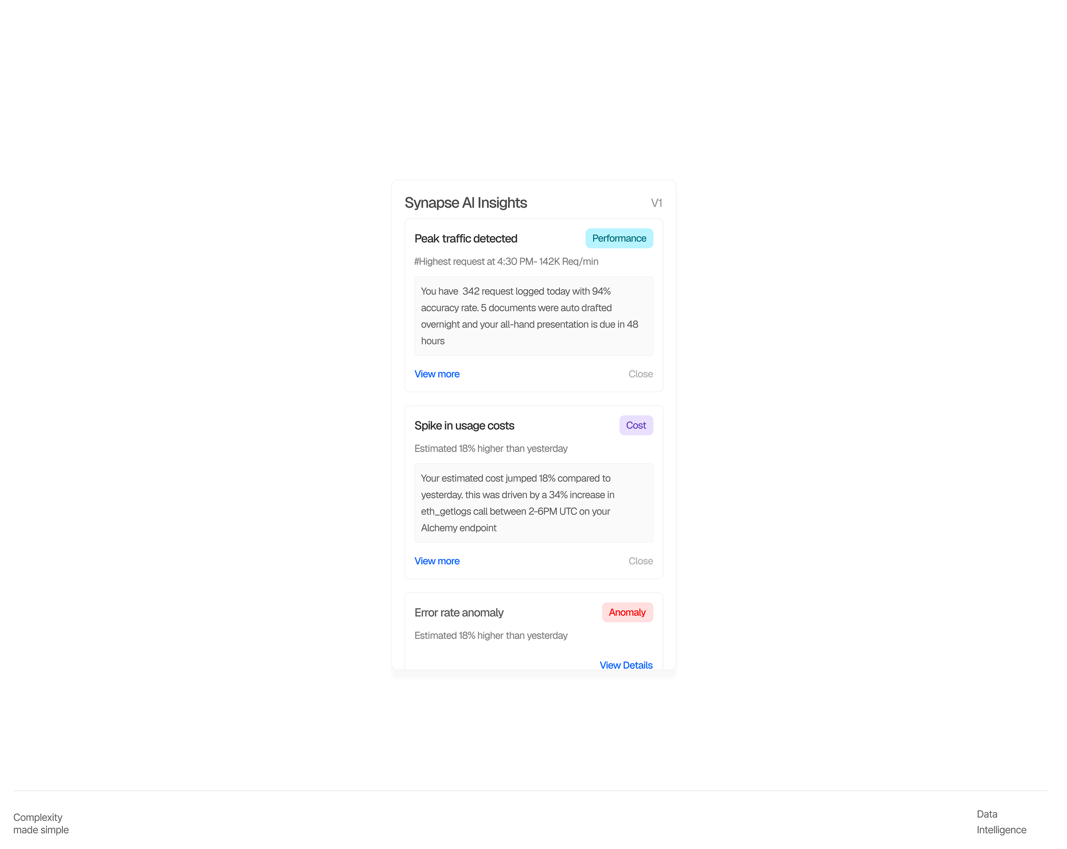
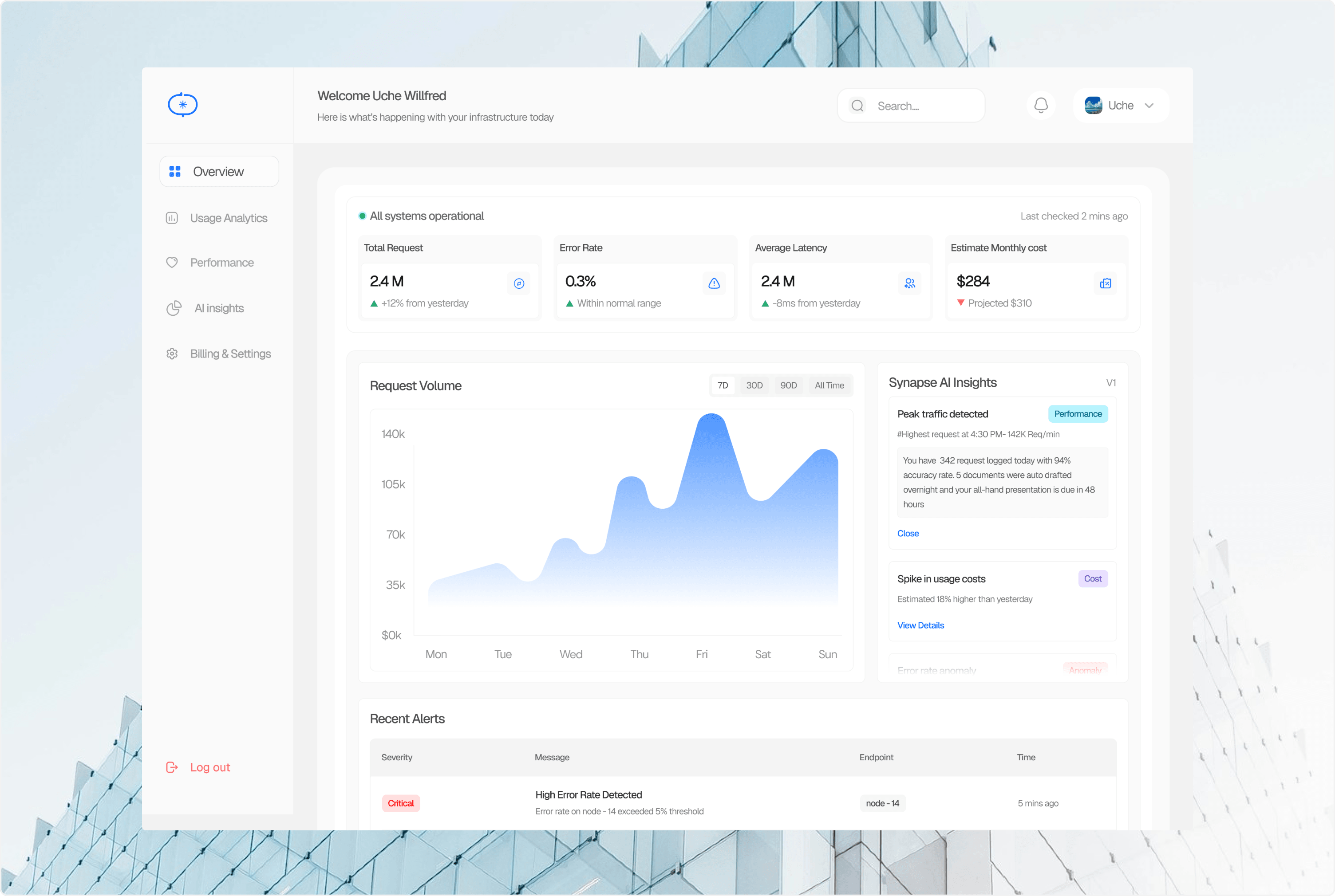
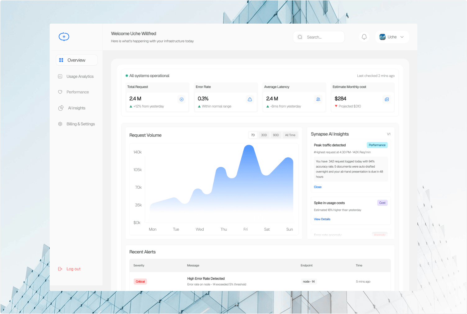
Synapse is an AI-powered RPC monitoring dashboard built for blockchain developers and infrastructure teams. Most RPC dashboards show you numbers — request volume, latency, error rates — and leave you to figure out what they mean. Synapse closes that gap. It surfaces the same data, but pairs it with AI-generated insights that explain what changed, why it happened, and what to do about it. I led design end-to-end, brand identity, product UI, and the design-to-code implementation while working solo as a one-person studio.

Synapse dashboard preview

Problem

RPC dashboards exist. Alchemy, Infura, QuickNode all have monitoring panels. But they share the same fundamental gap — they show you data without telling you what it means. A developer sees error rate spike to 2.3%. Now what? Is that bad? Which endpoint? What caused it? What should they do about it? Most tools leave that question unanswered. Synapse was designed to answer it.

Brand Identity

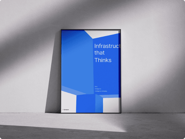
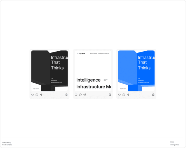
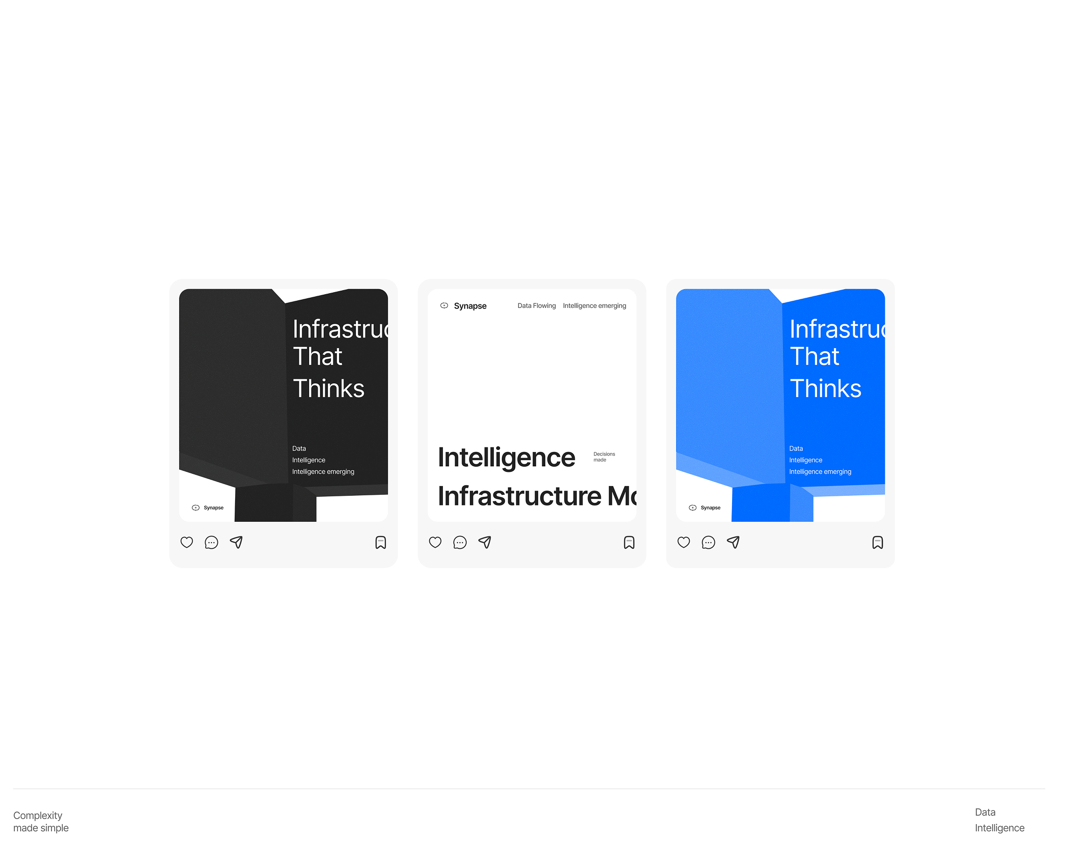
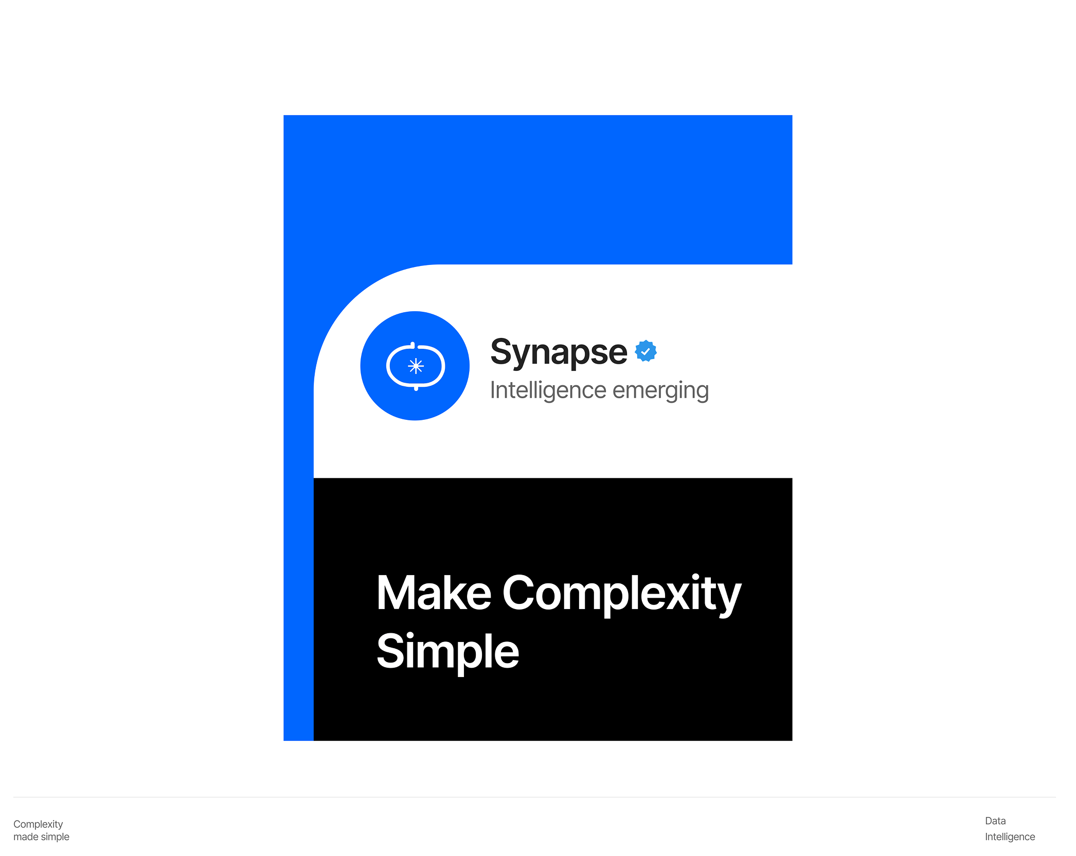
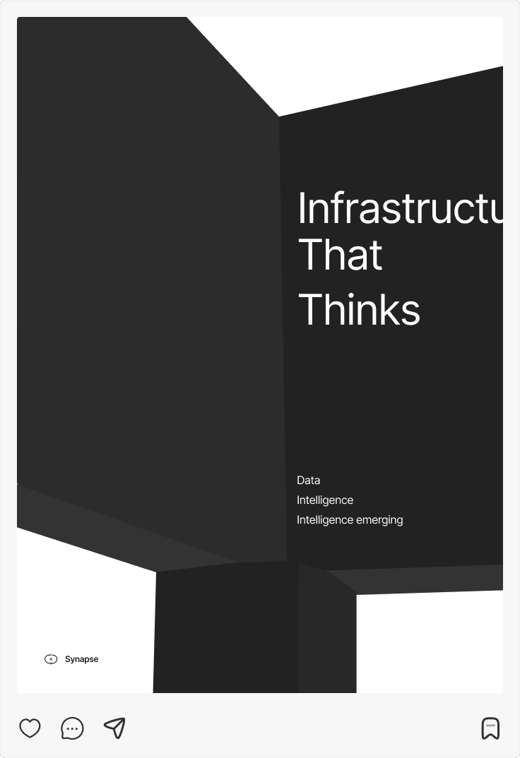
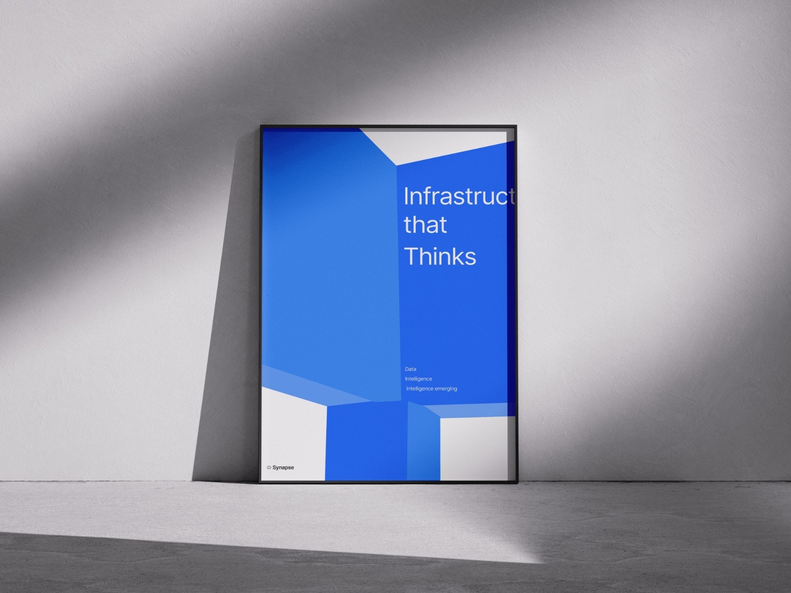
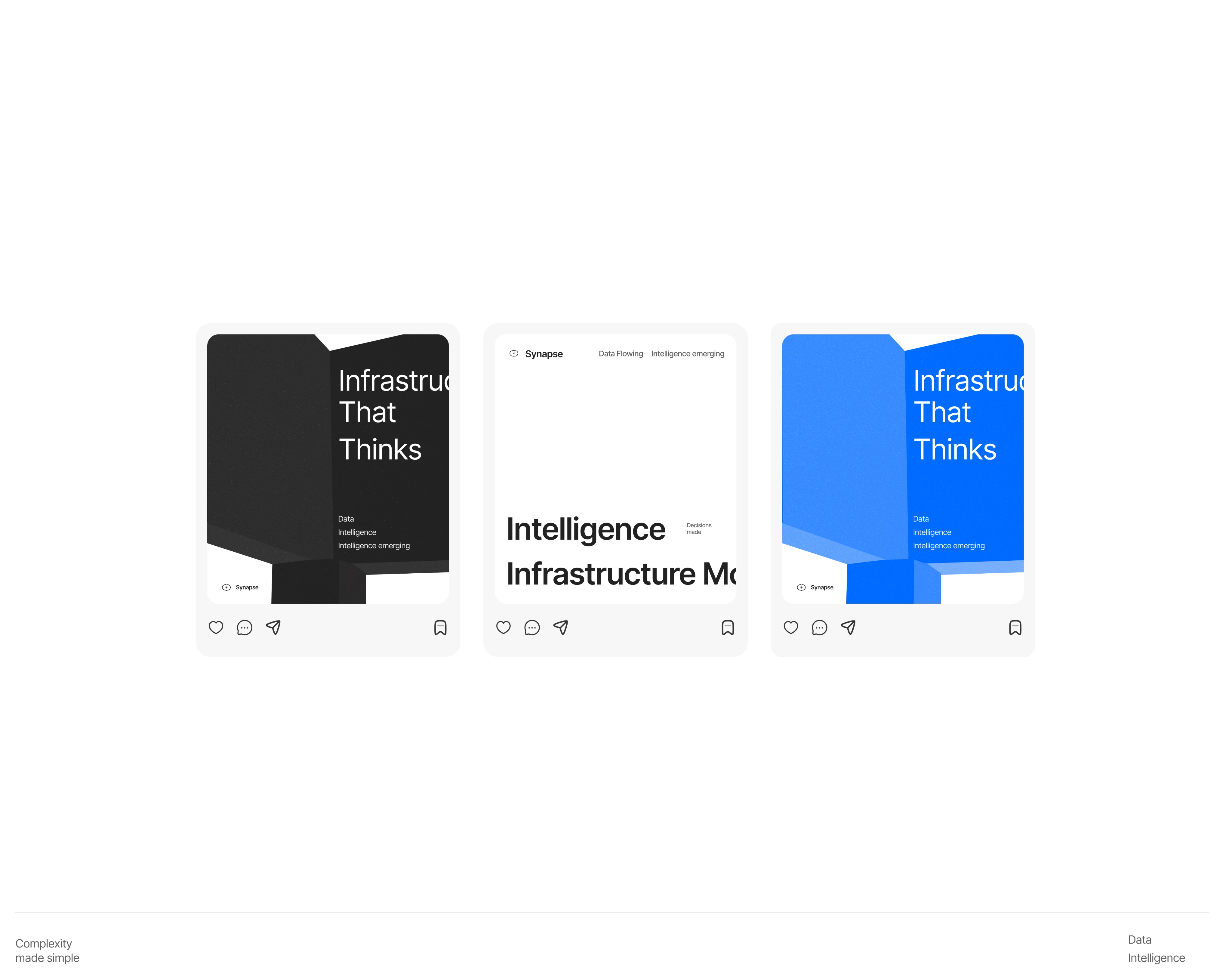
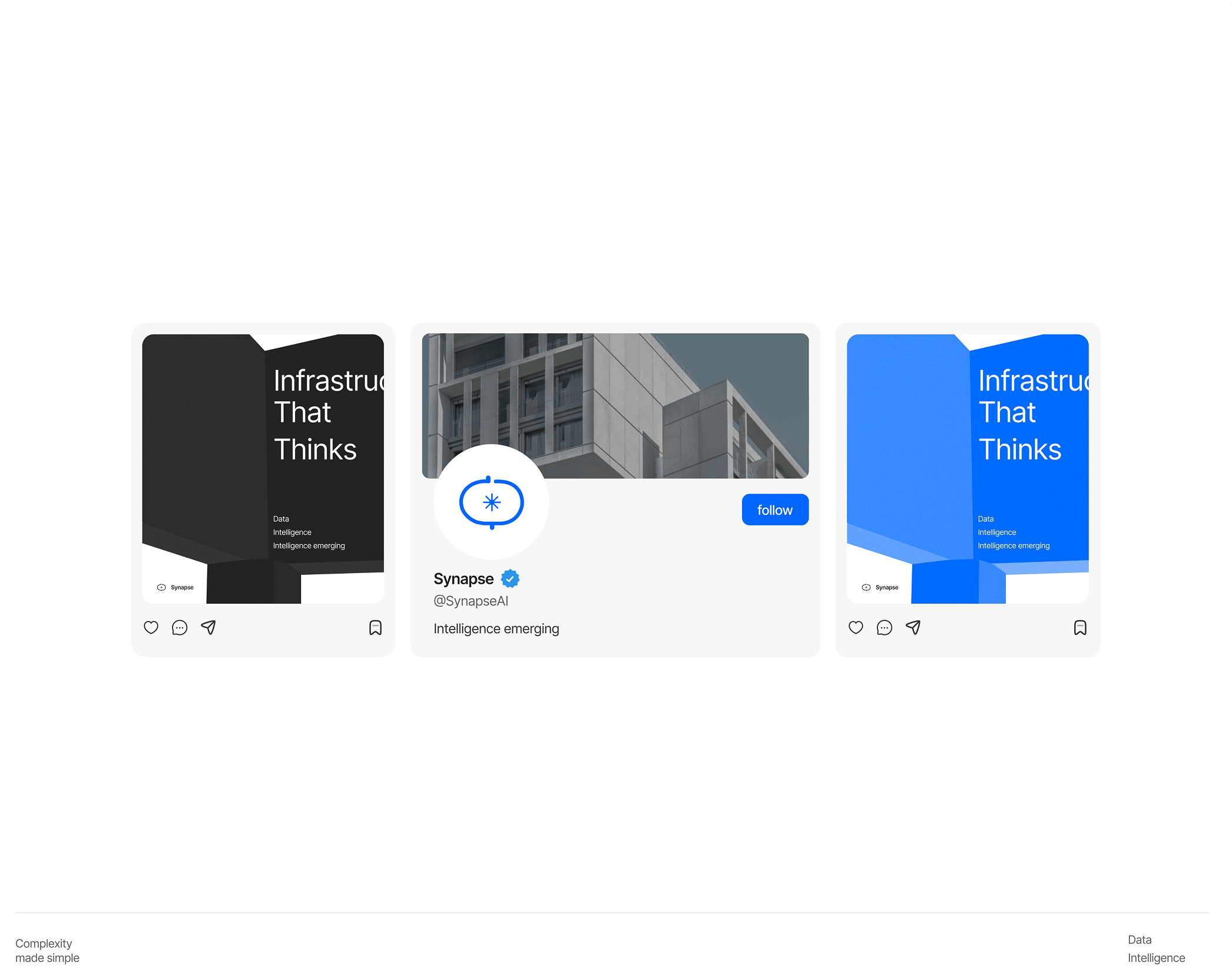
Neural Minimalism was born from the tension between two directions — neural tech and minimalism — and the decision not to choose between them. Scientific intelligence expressed through radical simplicity. The logo combines two ideas into one form: a flowing S that mimics how signals travel through synapses, with a firing dot representing the moment of transmission. A letter and a technical symbol simultaneously.

Brand image 1Brand image 2Brand image 3Brand image 4
Brand Image 5Brand image 6

Core Flows

Synapse is built around a single user journey, from sign-up to infrastructure clarity. Every screen was designed to reduce the distance between a developer arriving and a developer understanding what's happening with their RPC setup. The flow moves in four stages: sign-up, onboarding, dashboard overview, and deep analytics. Each stage has one job. None of them waste the user's time.

Core flows dashboard preview

Sign-up & Onboarding

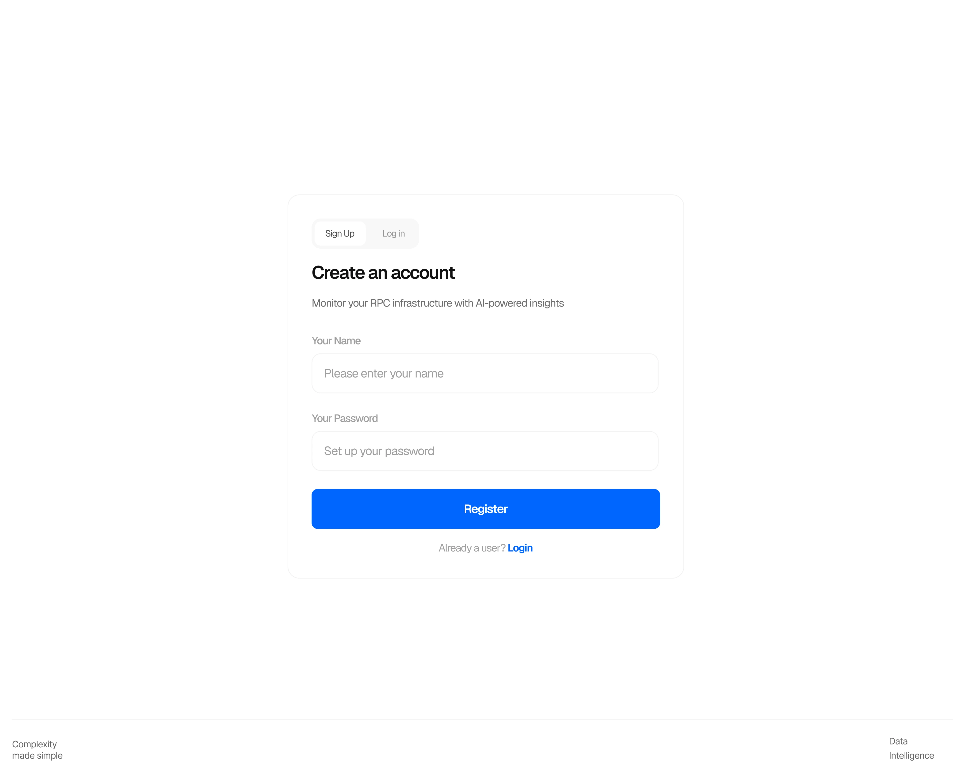
No friction. Three fields, one action, straight to the dashboard. Micro-interactions kept deliberately sparse — a logo pulse on load, blue glow on input focus, button loading state on submit. 150–250ms throughout. Calm, never loud.

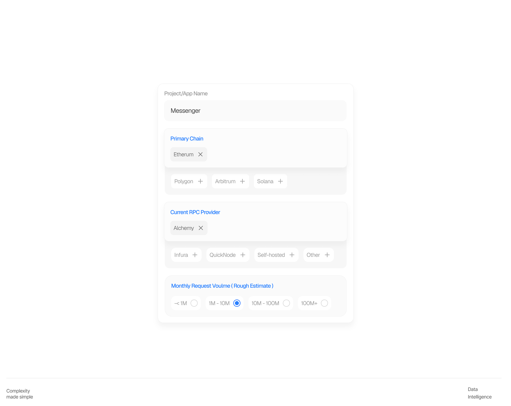
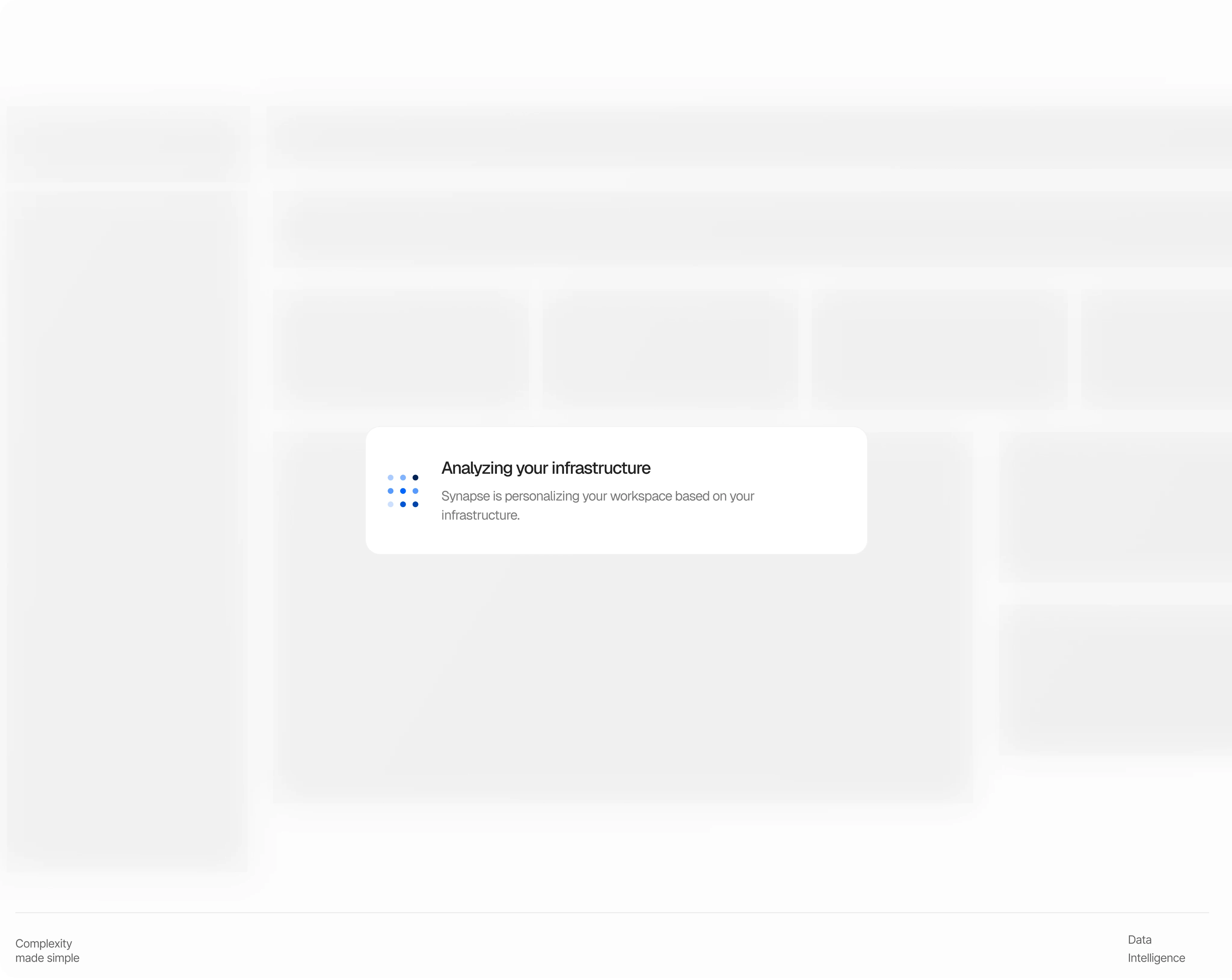
Onboarding collects four data points — chain, provider, project name, request volume — and feeds them directly into the AI layer. Without this context, insights are generic. With it, Synapse knows your stack from day one. The personalized loading state is the payoff referencing your actual chain and provider before you've even seen the dashboard. The first moment Synapse feels like it knows you.

Dashboard

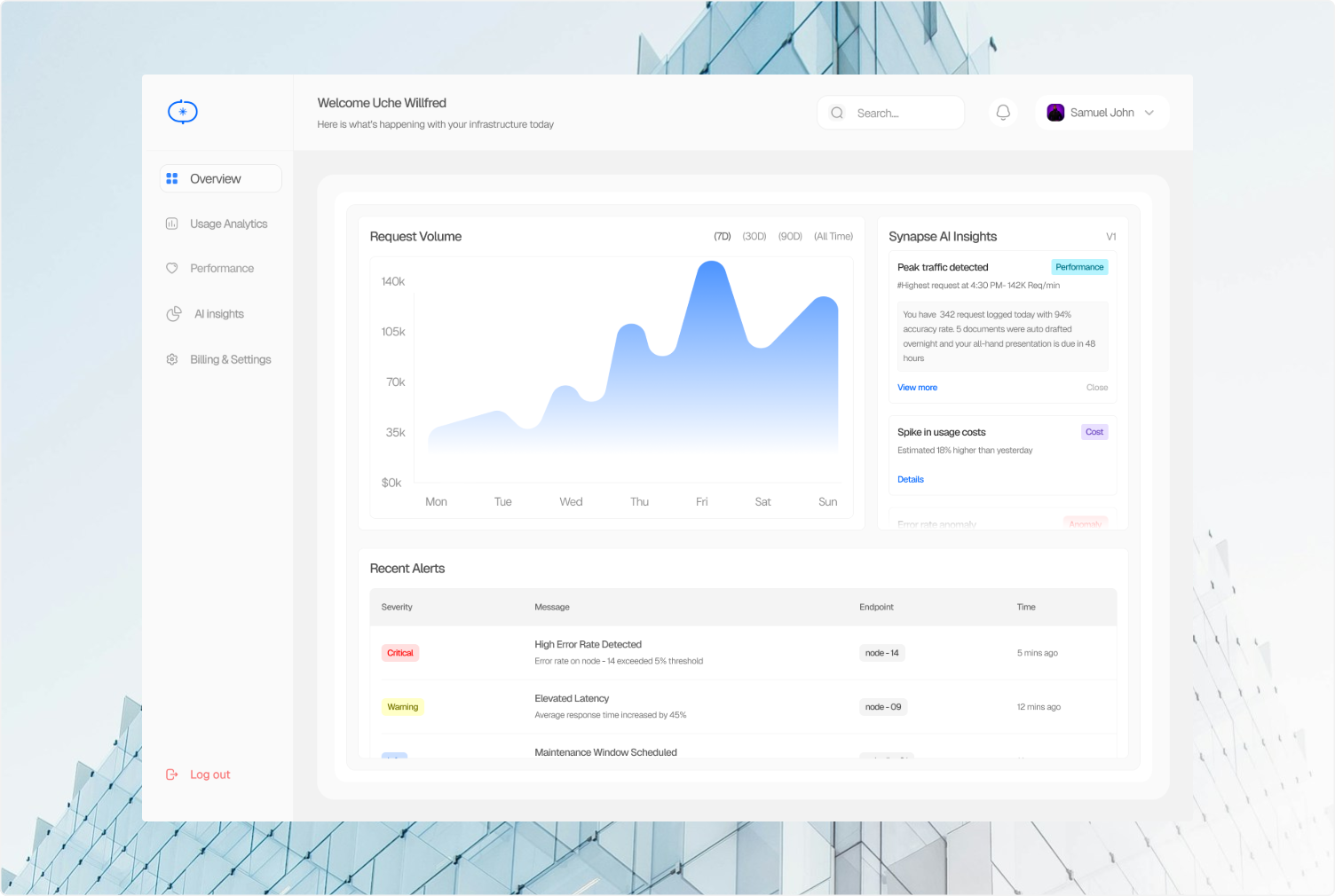
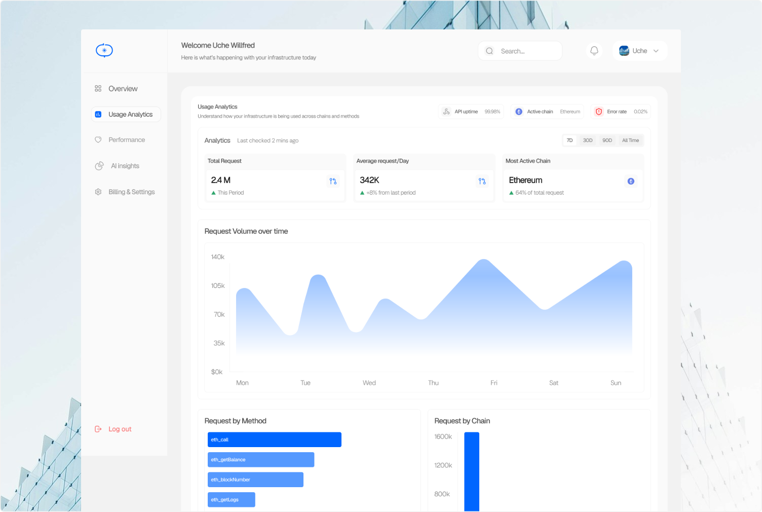
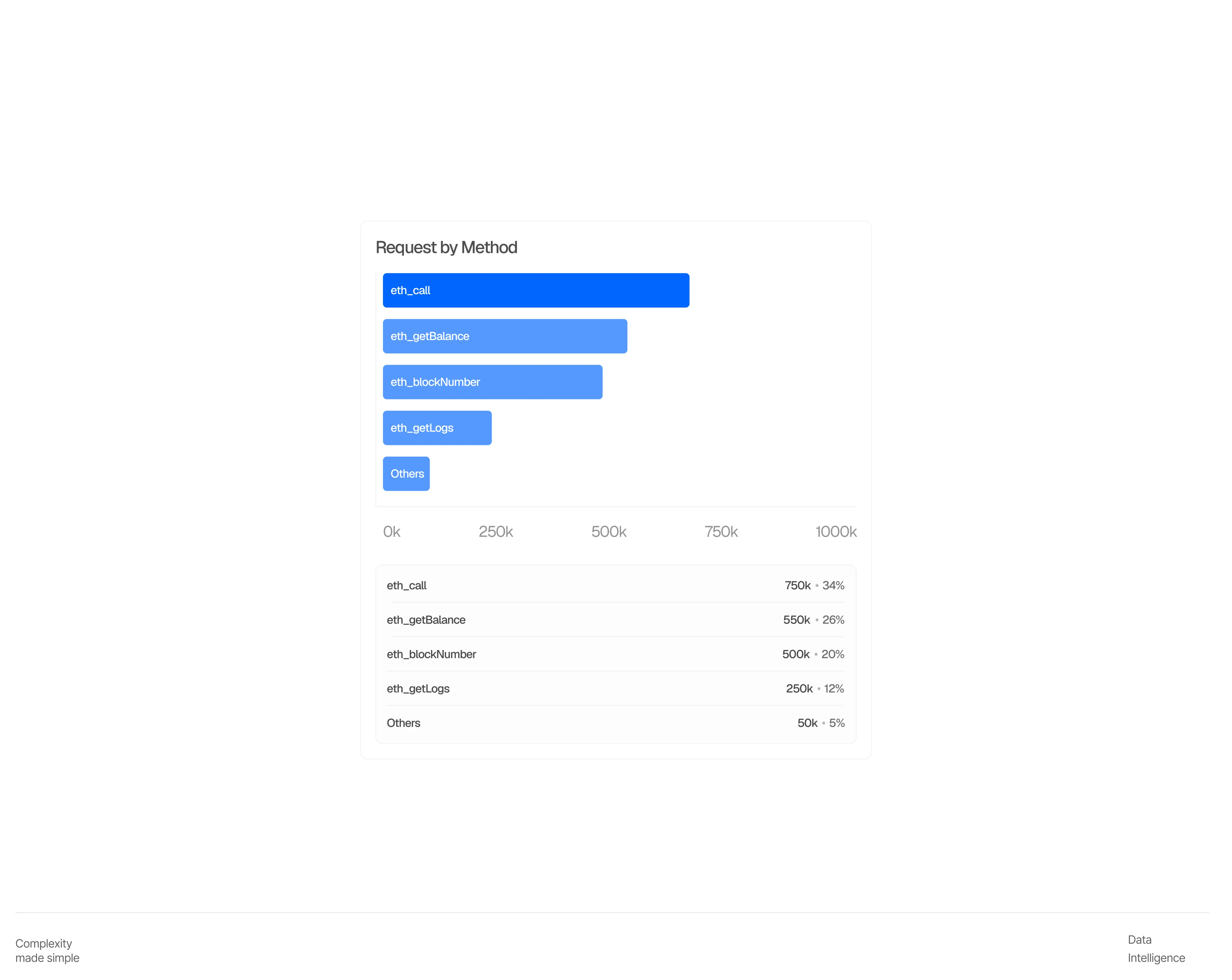
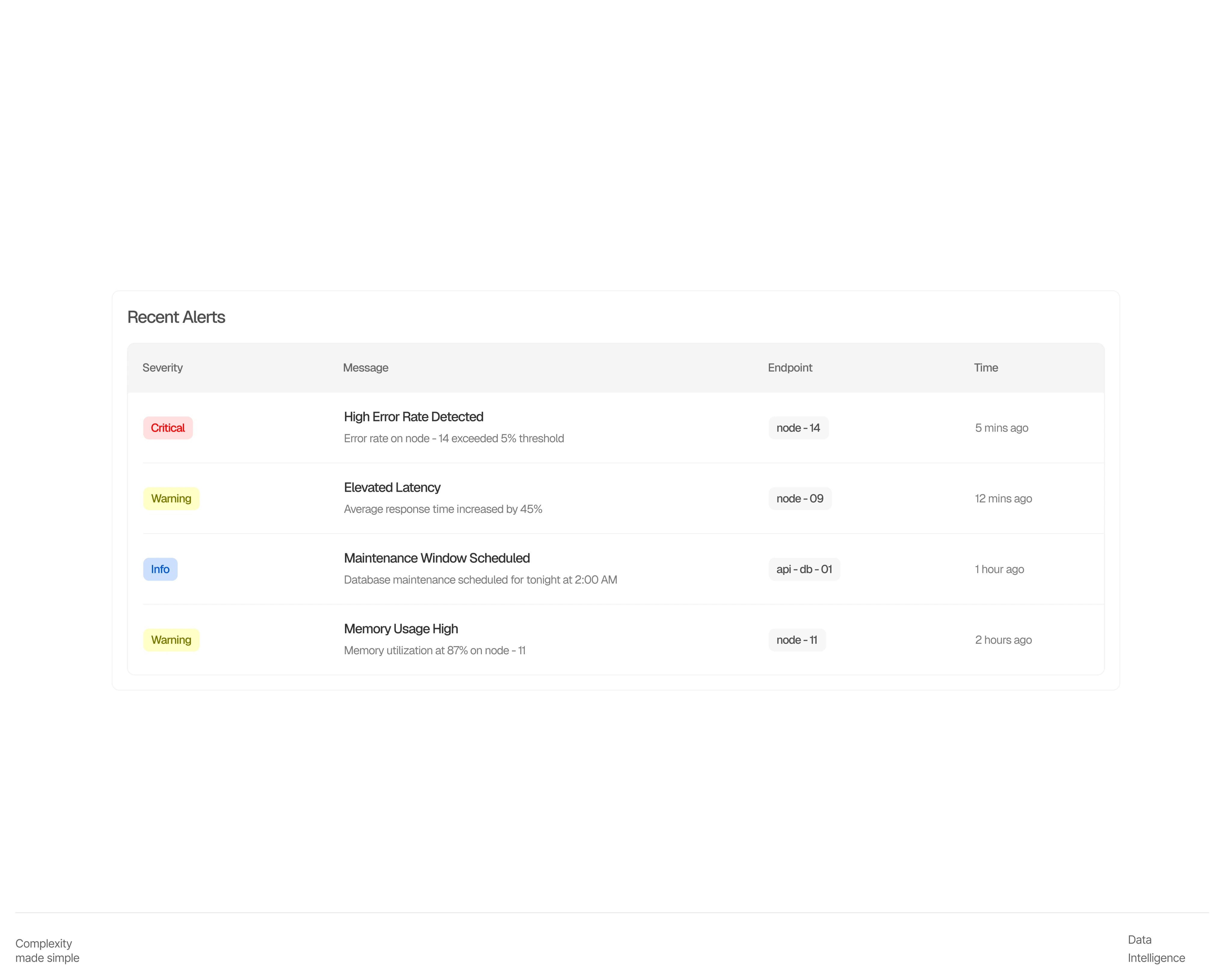
The dashboard was designed around one constraint: every screen had to feel like the same product without feeling like the same screen. Consistent components, consistent spacing, deliberately different layouts.

Light mode throughout. Linear-level breathing room. Electric Blue used only where it earns its place.

Back
OverviewProblemBrand IdentityCore flowsDesign DecisionsW.I.PDesign-to-codeW.I.PReflectionsW.I.P
SynapseAI-powered RPC dashboard, 2026

Making infrastructure legible

Intelligence emerging
SynapseSynapse
Complexity made simpleAn AI-powered RPC dashboard that explains infrastructure metrics in plain language.
DataIntelligence

Role

Product Designer

Brand Designer

Design Engineer

Timeline

May 2026–Jul 2026

Contribution

Product Design

Brand design

Design Engineering

Overview

Synapse is an AI-powered RPC monitoring dashboard built for blockchain developers and infrastructure teams.

Most RPC dashboards show you numbers — request volume, latency, error rates — and leave you to figure out what they mean. Synapse closes that gap. It surfaces the same data, but pairs it with AI-generated insights that explain what changed, why it happened, and what to do about it. I led design end-to-end, brand identity, product UI, and the design-to-code implementation while working solo as a one-person studio.

Synapse dashboard preview

Problem

RPC dashboards exist. Alchemy, Infura, QuickNode all have monitoring panels. But they share the same fundamental gap they show you data without telling you what it means.

A developer sees error rate spike to 2.3%. Now what? Is that bad? Which endpoint? What caused it? What should they do about it? Most tools leave that question unanswered. Synapse was designed to answer it.

Brand Identity

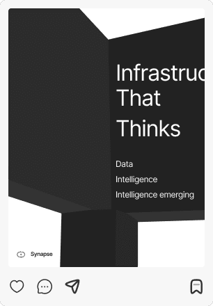
Neural Minimalism was born from the tension between two directions — neural tech and minimalism — and the decision not to choose between them. Scientific intelligence expressed through radical simplicity.

The logo combines two ideas into one form: a flowing S that mimics how signals travel through synapses, with a firing dot representing the moment of transmission. A letter and a technical symbol simultaneously.
Core Flows

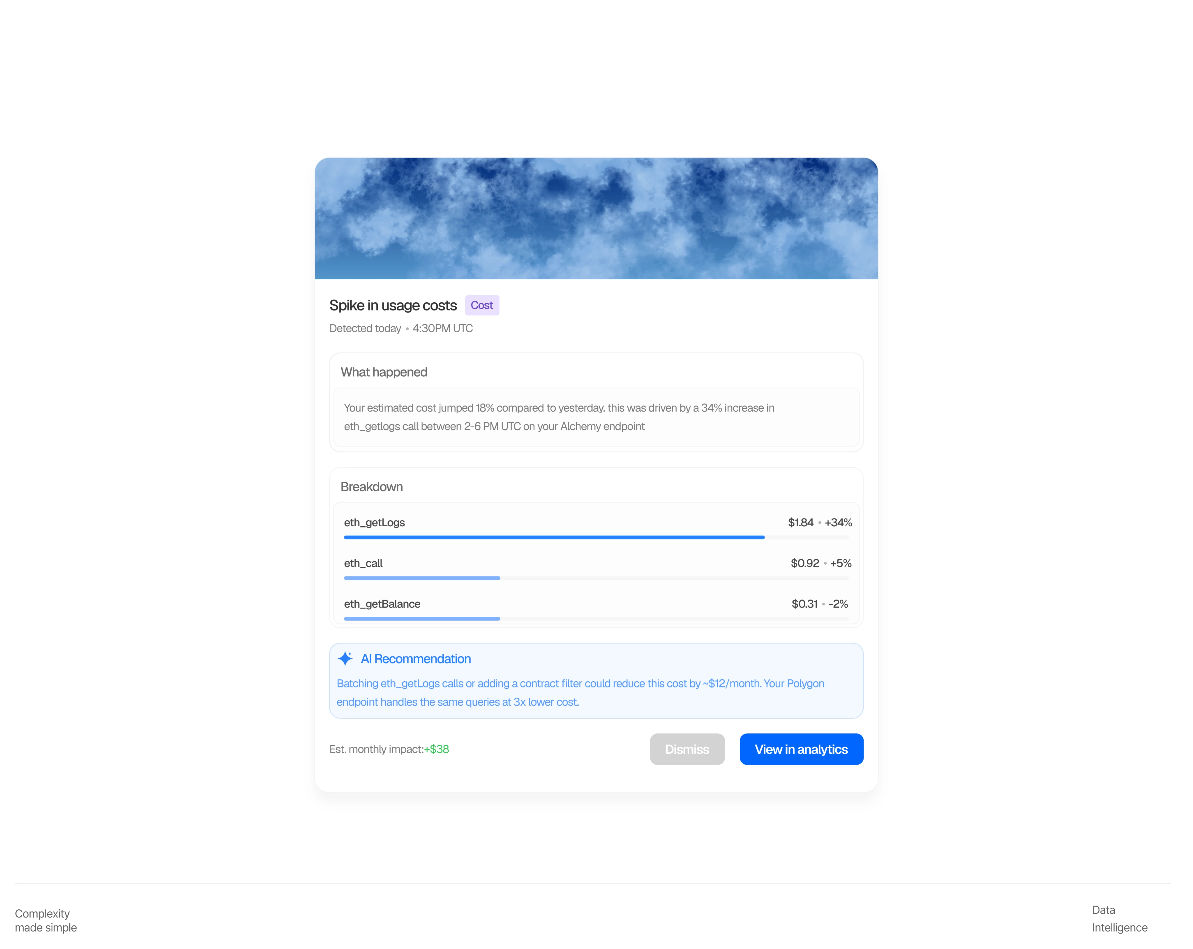
Synapse is built around a single user journey, from sign-up to infrastructure clarity. Every screen was designed to reduce the distance between a developer arriving and a developer understanding what's happening with their RPC setup.

The flow moves in four stages: sign-up, onboarding, dashboard overview, and deep analytics. Each stage has one job. None of them waste the user's time.

Core flows dashboard preview

Sign-up & Onboarding

No friction. Three fields, one action, straight to the dashboard. Micro-interactions kept deliberately sparse — a logo pulse on load, blue glow on input focus, button loading state on submit. 150–250ms throughout. Calm, never loud.

Onboarding collects four data points — chain, provider, project name, request volume — and feeds them directly into the AI layer. Without this context, insights are generic. With it, Synapse knows your stack from day one. The personalized loading state is the payoff referencing your actual chain and provider before you've even seen the dashboard. The first moment Synapse feels like it knows you.

Dashboard

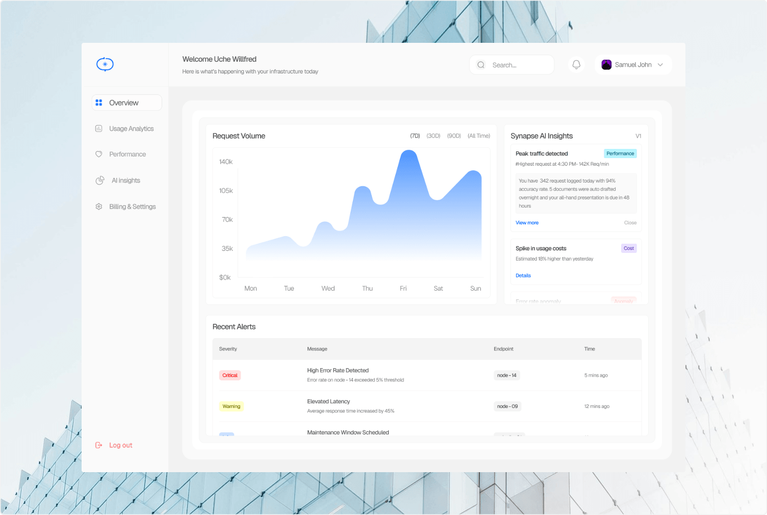
The dashboard was designed around one constraint: every screen had to feel like the same product without feeling like the same screen. Consistent components, consistent spacing, deliberately different layouts.

Light mode throughout. Linear-level breathing room. Electric Blue used only where it earns its place.